Graphics
Copyright 2022 Christopher William Purdom
previous random thumbs next

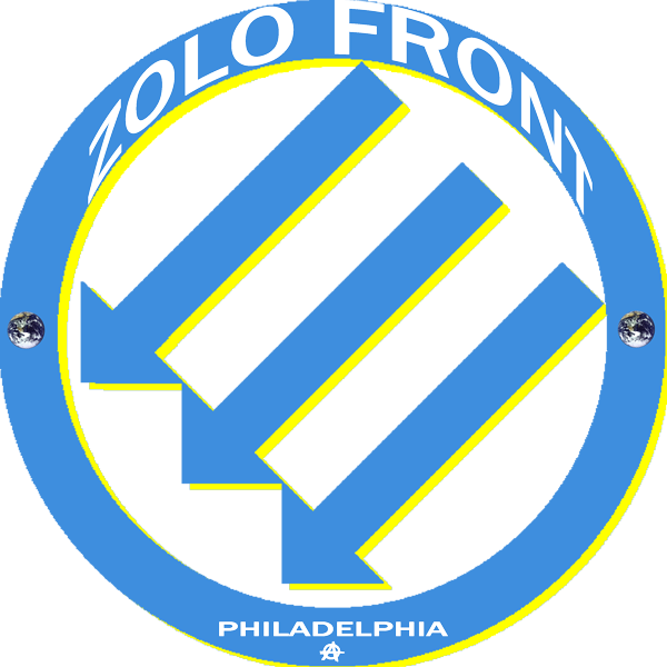
This is my second version of a Philly-specific Iron Front design, which I call Zolo Front. The idea was to get all of the elements into the circle, and I ended up playing around with weird perspective tricks. It's the same base design as Iron Zolos but with the colors reversed so that the lighter color is the shadow of the darker. The text at the top is curved at a slightly different angle as the circle itself, making it look like it's bending at the top, while the text at the bottom is flat. Both sets of text are transparent, so on a shirt you get the effect of looking through the circle, but without shadows, and the two small earth pictures which look like bolt heads are supposed to give the impression that the whole thing is somehow attached to the shirt. The original is 3000x3000.
previous random thumbs next
|
|
